


Like many of you, I was just flipping through search results on my phone one day to look for a good restaurant. For 2 seconds, one restaurant caught my eye and I clicked on the google link, expecting to see a fabulous tailored page on my phone. Loading..."Ugh, taking forever"... page appearing slowly... "What the heck is this?!"
Have you ever tried to check out a webpage on a smartphone, only to be disappointed like I was? Pages load slowly, buttons appear off-screen and out of sight, there's no way to find buttons for buying/calling/locating, no way whatsoever to find social media resources such as Facebook, Twitter, or Foursquare to share the link with friends…
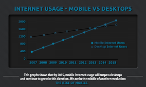
Having a great desktop website design does not guarantee success in business. If you have reviewed our mobile website services, you know how important responsiveness is to a business' website. Just take a look at this graph:
People are searching on mobile for everything, and the rates are worth of noting. Google backs it up by saying an incredible 89% of traffic comes from mobile searches. What do you want your customers to see on their phones? 79% of large online advertisers do not have a mobile-optimized site.
Your consumers are on mobile. As a marketer, you need to be on mobile too! Especially after making the effort to redesign your desktop webpage to entice them to visit, you can't afford to disappoint them on the phone.
What is a mobile-friendly website?
It is an adapted version of your website designed to work on cloud-storage-centered smartphones like iPhone, Android Phones, Windows and Blackberry.
So how can you adapt your website to make mobile users fall in love with it?
Keep in mind that a mobile webpage is but another version of your desktop homepage, so stay consist in content. Consumers will easily get confused and suspicious if you draft out too much new content on your mobile site.
Make it easy for people to take action.
You want to create a browsing experience that is useful and unique to mobile, so add Call-to-Action clicks: buttons for phone calls, Google maps, menus, etc.
Review your results.
Try to track how your customer interacts with your site and adapt your mobile page accordingly. It is also a great tactic to integrate your mobile web with other parts of your inbound marketing plan such as email campaigns, CTAs, and landing pages.
Generating Mobile adapted websites is not a passing trend. It is not too late to evolve with mobile-search- minded customers in this new era!